Solving Navigation Challenges for Better Engagement
time
1 month
Scope
Concept
User Experience Design
User Interface Design
Brand + Visual Design
Prototype
Tools
Figma
FigJam
Notion
Adobe CC
Tally
Overview
Start: Optimizing for the Horde
This project updates the Discord mobile app's user interface (UI) to improve the overall experience using the Double Diamond design process. Targeting Discord's main audience—gamers and online communities—my focus is to improve app navigation and make key functions easier to access.
By restructuring the UI, I attempt to address issues with finding specific features and aim to make the app easier to use.
💡 A subsequent Discord update (Jan/Feb 2024) reflected the same/similar design choices from this case study!
Problem Statement and Hypotheses
Finding the Quest
I started by focusing on this UI redesign due to personal frustrations with the Discord mobile app and to see if there was potential to improve the overall user experience.
To better understand the core issues, I analysed the -
Discord community forums
App page reviews (Play Store and App Store)
the Discord subreddit,
and Google searches
The key challenges identified were primarily navigation difficulties and a subpar mobile experience compared to the desktop version.
While technical constraints (app performance, backend management etc.) are not a primary focus of this case study, design constraints included adhering to Discord's brand guidelines/styles (without official access to the design system) and any relevant change logs or public user data.
The primary hypothesis was that the app's UI structure was a core issue. The validity of this was further confirmed by
conducting a user survey (30 submissions),
3 user interviews, and
reflecting on my own experiences with the product.
I then set out to design a more organized UI with the assumption that it would help users better understand how to navigate the app and find key functions more easily.
Research
Recon and Intel
To guide the redesign, I conducted an analysis of competing apps and examined Discord’s position in the market. I identified pain points in the existing mobile experience, then gathered direct feedback through a user survey and interviews. These insights helped define key user personas and shaped the direction of the new UI.
Market and Competitor Analysis
Scouting Party
I analyzed the most direct competitors like Guilded, Microsoft Teams, and Slack, focusing on their gaming or community features. Indirect competitors like Google Meet, Skype, and WhatsApp, which have similar communication features, were also examined.
My key findings from the competitor analysis are:
Guilded: Offers special channels for voice, text, and events, with server setups based on game requirements. However, it has fewer users and is mainly used for gaming groups categorised by the game title.
Microsoft Teams: Good for project management but not for casual communities.
Slack: Has robust communication features and API for customization but can be overwhelming with notifications.
Google Meet: Makes it easy to start video calls with a simple interface but is limited to video and audio.
Skype: A legacy conferencing app with a simple and linear UI but has accessibility issues.
WhatsApp: Has a simple UI and many users but makes channels hard to use.
This analysis helped find ways to improve Discord's mobile app UI, such as making workflows smoother and improving community features.
Existing issues
Debugging the UX
Heuristic analysis mainly showed problems with -
Consistency
Clear system status
Recognition vs. recall
While general ratings between surveys and secondary research were not critically bad, the most recurring challenge was that users found it difficult to find key functions in the mobile interface. Keeping these issues in mind, I focused on app navigation and core function discoverability within the UI.
User survey and interviews
What do you think, chat?
My user research attempted to understand how the Discord mobile app was being used, and if the participant was not an active user, what parallel experience of theirs could inform a better UI design.
Key points from my user research (30 survey takers) include:
Age Range: Most users are between 25 and 35 years old (62%), which is consistent with Discord's target audience.
App Usage: 34% of people use the Discord mobile app.
Feature Usage: All users use the chat and community features, and 60% use voice and screen sharing.
Frequency of Use: 40% of users access Discord on their mobile devices 1-5 times per week, and 20% use it more than 20 times a week.
Feature Ratings: Chat, voice, screen sharing, and community features were rated around 4.2/5 on average. Bots and integrations were rated 3.5/5.
Connecting the survey results with my secondary research showed that while users were motivated to use the product and it's core offerings, they still weren't happy with the UI and navigation.
Similarly, the 3 user interviews I conducted, with a power user, casual user, and a non-user, resulted in the mobile app being used primarily as a limited messaging application, leaving core functions like voice/video streaming to the desktop version. This further indicated that changes to the core navigation and organisational experience of the app were justified.
Ideation
Crafting the Meta Build
Based on the user research and survey data, I developed three distinct personas representing key user groups for the Discord mobile app:
Design
Levelling up
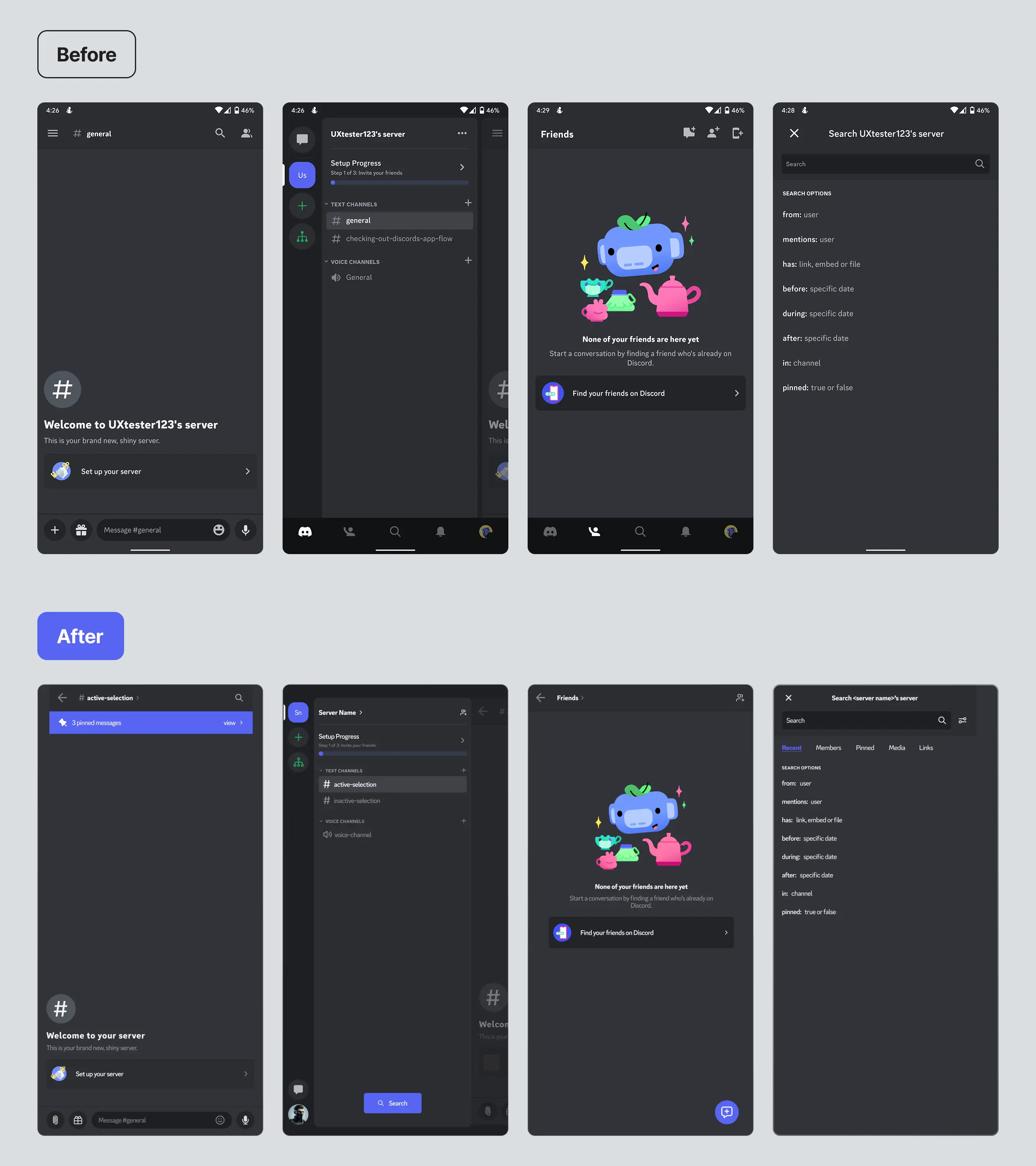
The design phase involved recreating the existing UI, auditing the design, restructuring or changing the layout, and adding new features (sometimes inspired by other apps) while adhering to the brand style/design guidelines.
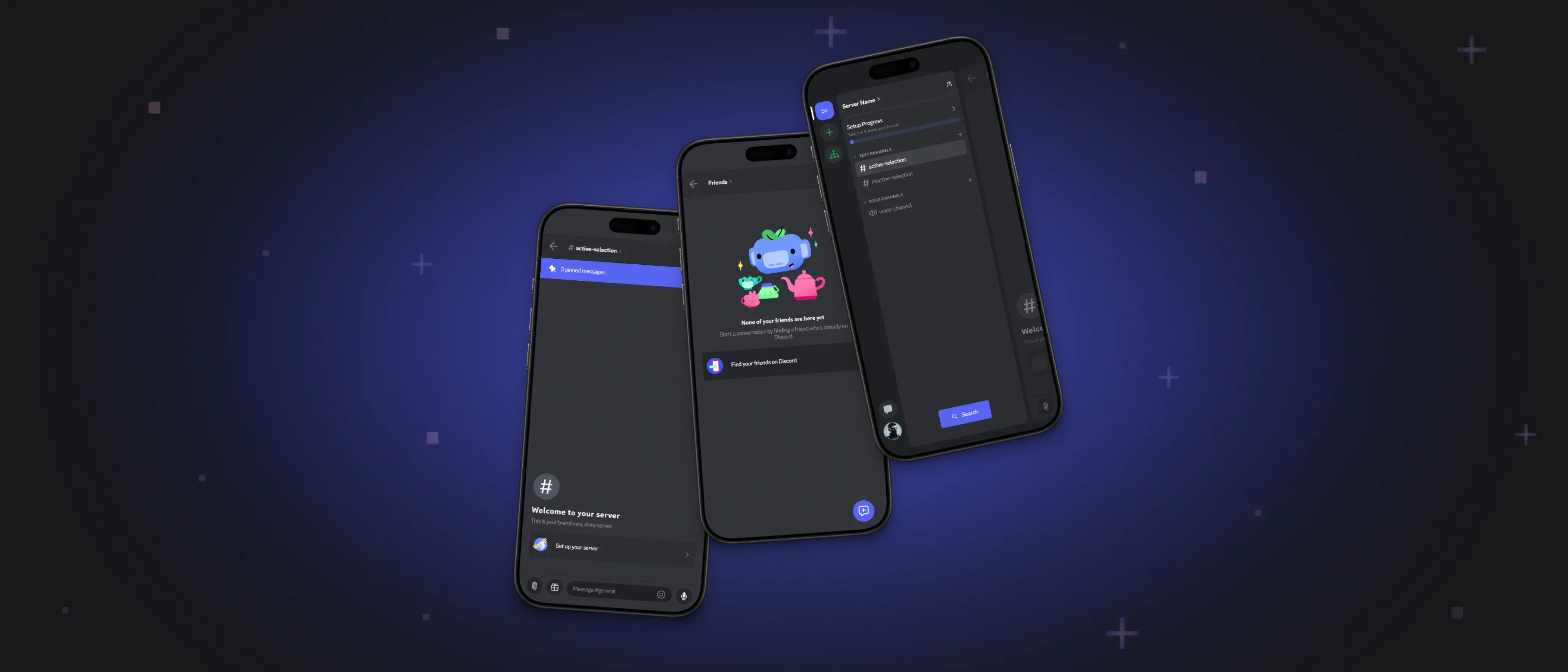
Global Changes:
The bottom navigation bar was removed, and its functions were integrated contextually into other parts of the app to streamline the UI and reduce navigation burden.
The new integrations flow to the pre-existing screens to preserve mobile and desktop app parity.
Server Screen:
The sidebar size was increased for easier tab selection.
The friends/DM tab was moved from the top left to the bottom of the sidebar to keep server switches and messaging separate.
The user profile setting was moved to the sidebar for constant access.
Directional context menus were added for easier access to options like notifications and settings.
A server-level search function was added for quicker navigation and content searches.
Standard notification visuals were added at the server and channel level to improve user interaction with the server.
Text Channel Screen:
Direction indicators were added for easier navigation and access to channel options.
The member management button was moved to the server screen.
A "pinned messages" function was introduced (inspired by Slack).
The attachment icon was replaced with a more classic paperclip icon.
Friends List Screen:
Direction indicators were added for easier navigation.
The different add options were collapsed into one menu.
A persistent floating button was added for new messages.
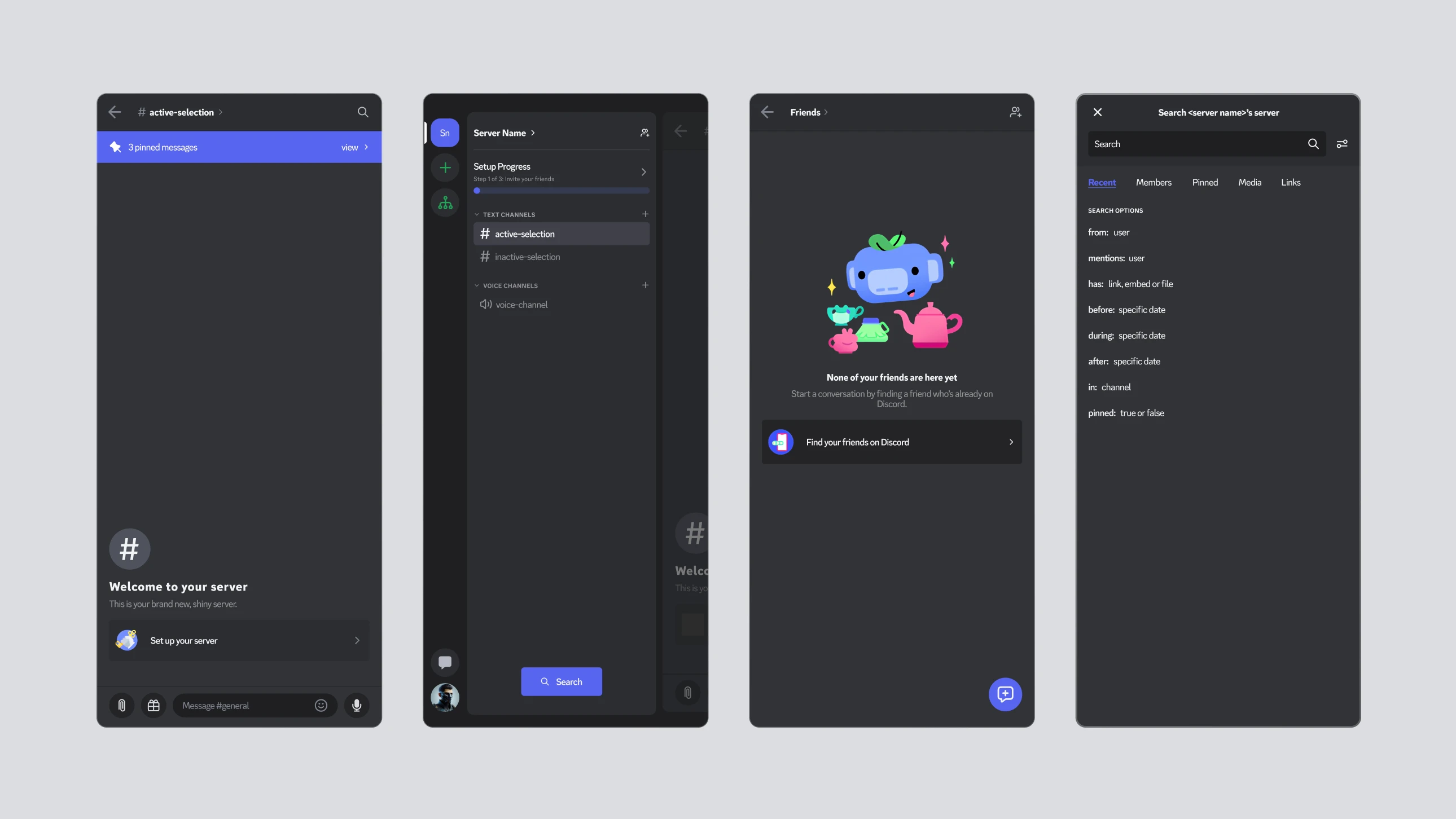
Search Screen:
Search interactions were kept as a dedicated screen.
A filter system was added to filter results by person, field, channel, and time.
Another layer of persistent sorting was added through tabs above the search results.
Connecting the Personas to UI Changes
These UI changes were designed to address specific pain points identified through the personas.
By addressing the pain points of these personas, the UI redesign aims to create a more intuitive and user-friendly experience for all Discord mobile app users.
Insights
Objective complete, ggwp
This project helped highlight the importance of community feedback to shape successful product development for me. Two key process challenges were:
the time-intensive nature of documenting all the different functions and their positions
structuring effective user research methods to account for users and non-users
Due to project constraints, formal prototype validation and user testing could not be conducted. However, a subsequent Discord update (Jan/Feb 2024) with similar design choices (most of my UI recommendations) shows that this project is on the right track.
Future explorations could include exploring different interaction patterns (e.g. gestures or swipe functionality), making the mobile app a companion to the desktop experience for community managers and streamers (similar to Spotify’s cross platform controls), or a larger component library to potentially improve functionality while keeping the interface minimal.
The Discord application is central to the gaming and community culture on the internet and understanding the complexities of a niche communication application has been a great learning experience.